| Python | R | |
| 선으로 그리기 |
plt.plot(co2.seq, co2.x)
|
lines(smooth(co2),col='BLUE'
|
| 수학적 함수 그래프 |
plt.plot(x, y)
|
plot(x,y,type="l")
|
| 버블플롯 |
plt.scatter('temp', 'wind', s='SO2', alpha=0.9, data=USairpollution)
|
plot(wind~temp, data=USairpollution, pch=9) with(USairpollution, symbols(temp, wind, circle=SO2, inches=0.5, add=T)
|
| 이변량으로 확대한 상자그림 |
bvbox(x, xlab="manu", ylab="popul", pch=19)
|
1) R 이변량 그래프
- R bivariate graph
# BiVariate Graphe
# plot using lines
plot(co2)
lines(smooth(co2),col='blue')
지난 번 lines(smooth(co2),col='blue') 해당 부분과 비슷한 줄에서 에러가 났었는데 해결 방법을 찾았다.
mac에서는 "RED" 이렇게 쓰면 string으로 인식해서 에러가 났는데 'red' 이런식으로 해주면 에러가 나지 않는다.
# plot of mathematical functions
x <- seq(0, 20, 0.1)
y <- exp(-x/10)*cos(2*x)
plot(x,y,type="l")
- R bivariate boxplot
> library(HSAUR2)
> library(MVA)
> data(USairpollution)
> head(USairpollution, 3)
            SO2 temp manu popul wind precip predays
Albany       46 47.6   44   116  8.8  33.36     135
Albuquerque  11 56.8   46   244  8.9   7.77      58
Atlanta      24 61.5  368   497  9.1  48.34     115
> x = USairpollution[, c(3,4)]
> bvbox(x, xlab="manu", ylab="popul", pch=19)
> title("Bivariate Boxplot")
> identify(x)
[1]  7  9 14 30
> rownames(x)[c(7,9,14,30)]
[1] "Chicago"      "Cleveland"    "Detroit"
[4] "Philadelphia"
- R bubble plot
> plot(wind~temp, data=USairpollution, pch=9)
> # symbols(USairpollution$temp, USairpollution$wind, USairpollution$circle=SO2,
> # inches=0.5, add=T))
> with(USairpollution, symbols(temp, wind, circle=SO2, inches=0.5, add=T))
> title("Bubble plot")
2) Python
https://colab.research.google.com/drive/19Ex0LqUkU1OrG-qdpJU2lNsyIHS04_QZ?usp=sharing
UnivariateBivariateMultivariate.ipynb
Colaboratory notebook
colab.research.google.com
import pandas as pd
import numpy as np
import matplotlib.pyplot as plt
# 데이터 읽기
co2 = pd.read_csv("/content/drive/MyDrive/DataAnalytics/MultivariateAnalysis/mva/co2.csv")
co2.head(2)
# 변수이름 지정하기
co2.columns = ["seq", "x"]
co2.head(2)
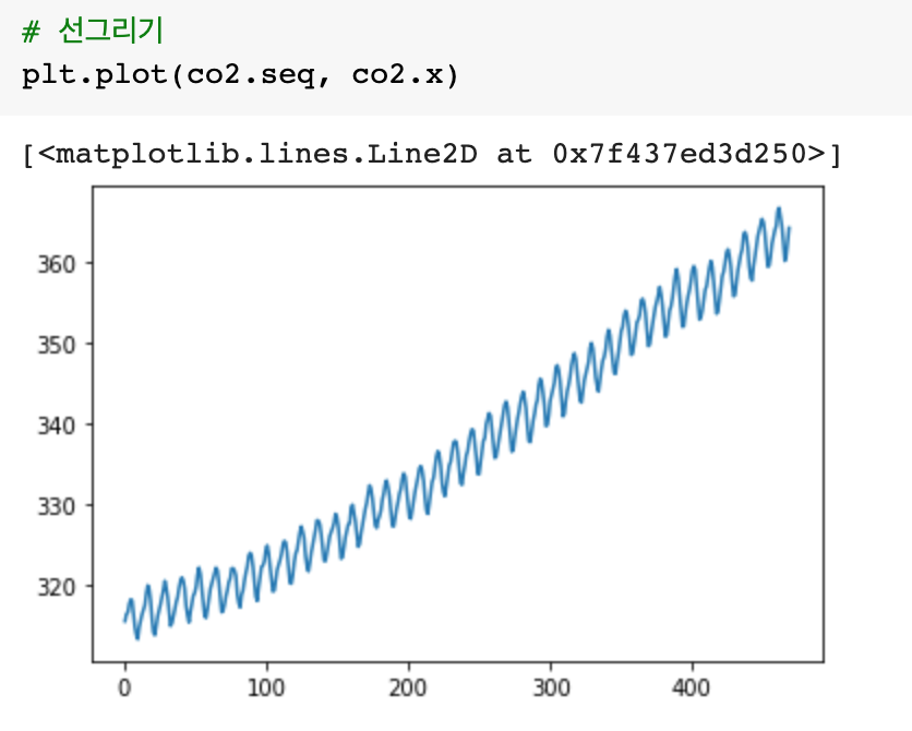
# 선그리기
plt.plot(co2.seq, co2.x)
# plot of mathematical functions
x = np.arange(0, 20, 0.1)
y = np.exp(-x/10)*np.cos(2*x)
plt.plot(x, y)
# 데이터 읽기
USairpollution = pd.read_csv("/content/drive/MyDrive/DataAnalytics/MultivariateAnalysis/mva/USairpollution.csv")
USairpollution.head(3)
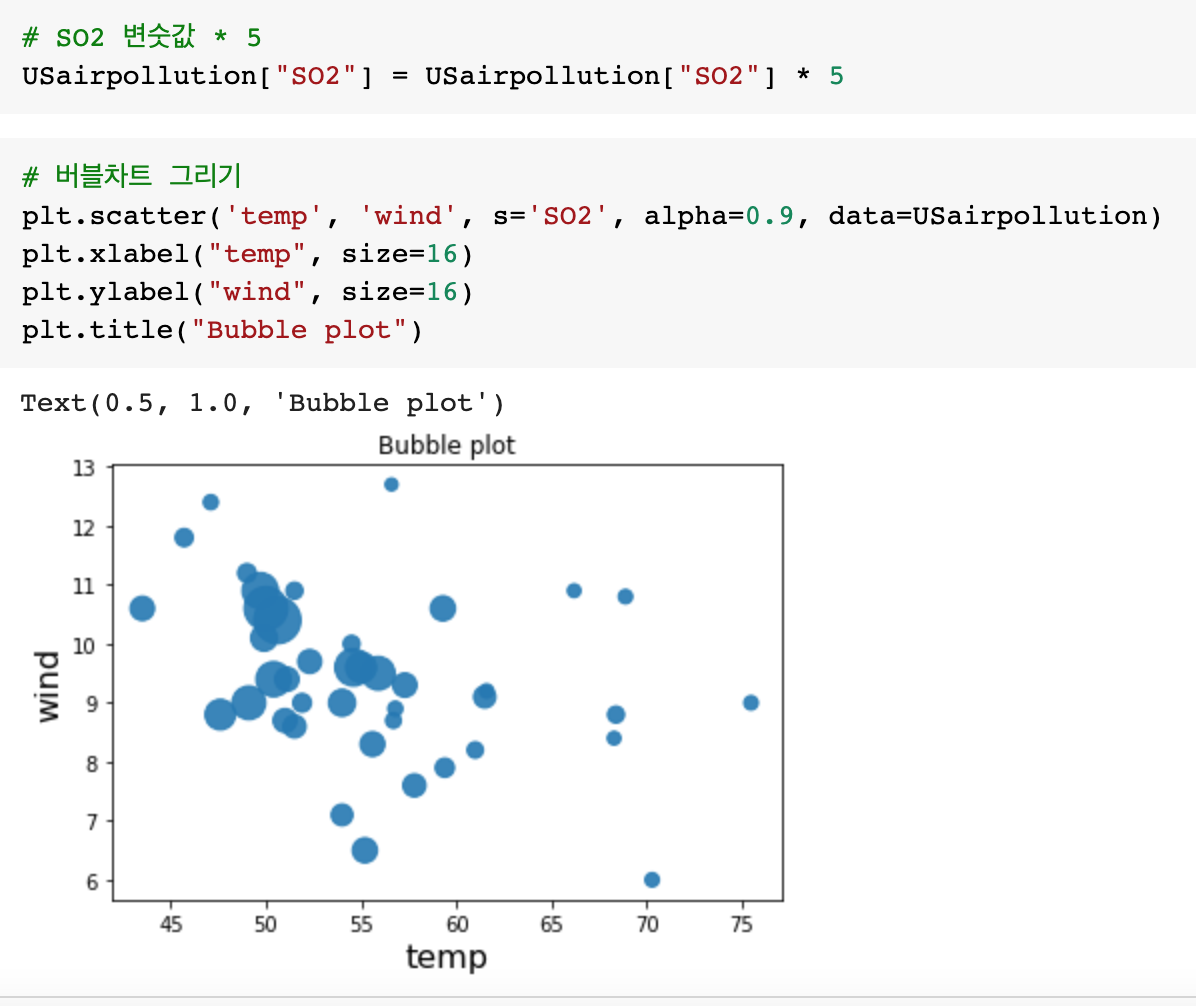
# SO2 변숫값 * 5
USairpollution["SO2"] = USairpollution["SO2"] * 5
# 버블차트 그리기
plt.scatter('temp', 'wind', s='SO2', alpha=0.9, data=USairpollution)
plt.xlabel("temp", size=16)
plt.ylabel("wind", size=16)
plt.title("Bubble plot")
# help(plt.scatter)


반응형
'Data Science > Multivariate Analysis' 카테고리의 다른 글
| [Multivariate Analysis] Principal Component Analysis(PCA) 주성분분석 (0) | 2022.03.18 |
|---|---|
| [Mulivariate Analysis] eigenvalue(고유값)과 eigenvector(고유벡터) (0) | 2022.03.18 |
| [Multivariate Analysis] 다차원 통계그래프 (0) | 2022.03.13 |
| [Multivariate Analysis] 단변량 통계그래프 (0) | 2022.03.13 |
| [Multivariate Analysis] 기술통계량 및 분할표 (0) | 2022.03.12 |


댓글